How to make better, more useful brand guidelines
Brand guidelines, style guide, brand book… it’s a tool that goes by many names. But most of them don’t really tell us that much about UX design. Jonas Lampe shares 7 questions to ask yourself when building brand guidelines for UX design.
Many companies tend to think they have everything in place when they have a logo drawn, colours chosen and font family selected. But that’s rarely the full story. In fact, it’s just the beginning.
Brand guidelines have been around for a long time, and most of us working in the field of design, tech and marketing are very familiar with them. User experience (UX) design, which has been the latest 21st century design buzzword, is now a common way for people to describe user-centred design. These two areas ‒ branding and UX ‒ are often two departments and two fields of expertise. UX professionals focus on usability and meeting user needs, while branding department people tend think more about ads, campaigns and logotypes.
Leading the way and guiding decision making
If you’ve only encountered rich brand guidelines that are very easy to use in your digital design work, consider yourself lucky. However, if you feel the opposite, then this might help you and the people you work with to create better brand guidelines, that work for all your needs.
Where visual design in print is often about getting attention and standing out, visual design in a digital context is about leading the way and guiding people to make decisions. The digital context is often interactive and demands a lot more because of its changing nature. Within an interactive system, the user needs to know where to press and if what was pressed is really working. You also need some feedback to make sure you’re on the right track, in order to make you feel safe and in control. Today, we believe that it’s about being flexible and prepared for new environments, digital environments.
“Where visual design in print is often about getting attention and standing out, visual design in a digital context is about leading the way and guiding people to make decisions.”
Jonas Lampe Visual Designer, Daresay
Does your logotype have a shape that works well in a user interface?
A logotype should have a shape that is as square or rectangle as possible to fit most user interfaces. Ask yourself if the logo has to be visual at all times. A well designed product should be able to carry and communicate your brand even without a logo present.
Do you have a colour palette that supports alerts and warnings?
If you have an app or a website, you need to be prepared to communicate with the customer when there are mishaps, and you need to have an appropriate colour scheme to reflect the right tone. Consider hues for both rewarding and negative communication. There have been brands that selected red as their primary color, which can cause great confusion for users because of its negative, error-message associations.
Do you have a recognisable visual expression to enforce your brand?
Patterns are a very strong brand carrier and useful in a digital context, replacing a solid background colour or a generic photo.

Are your brand guidelines accessible?
Are your brand guidelines digital, and somewhere everybody in the company can find them? Or are they hidden in the company intranet, or even worse, in your drawer in a printed format? Your brand will only be at its full potential when you communicate its values and how to use it. Build it thoughtfully and with care.
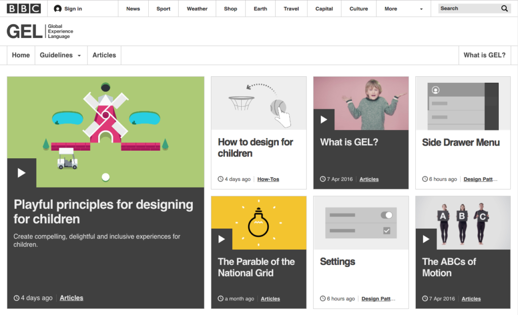
The BBC has made a real effort when it comes to brand UX guidelines. “Maintaining consistent UX design across all touch-points, from mobile phones to connected TVs, is vitally important.” David Bailey, Creative DIrector BBC. Read more about this wonderful design framework here.
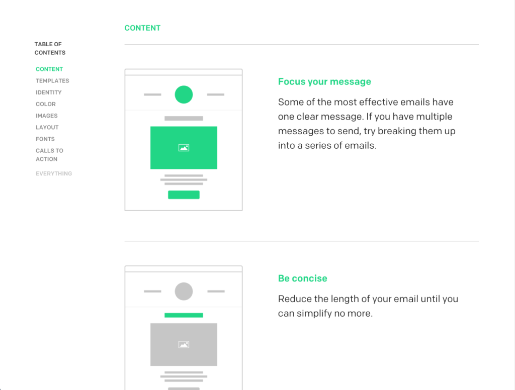
Mailchimp has a complete layout explanation when it comes to digital design. Visit Mailchimp for inspiration.
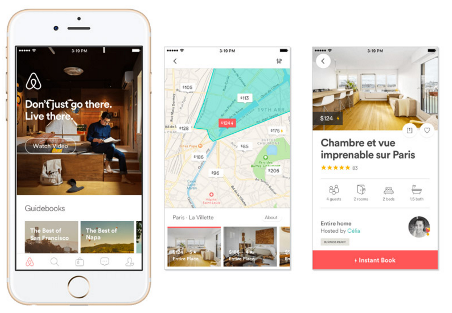
“A unified design language shouldn’t be just a set of static rules and individual atoms; it should be an evolving ecosystem.” Airbnb.
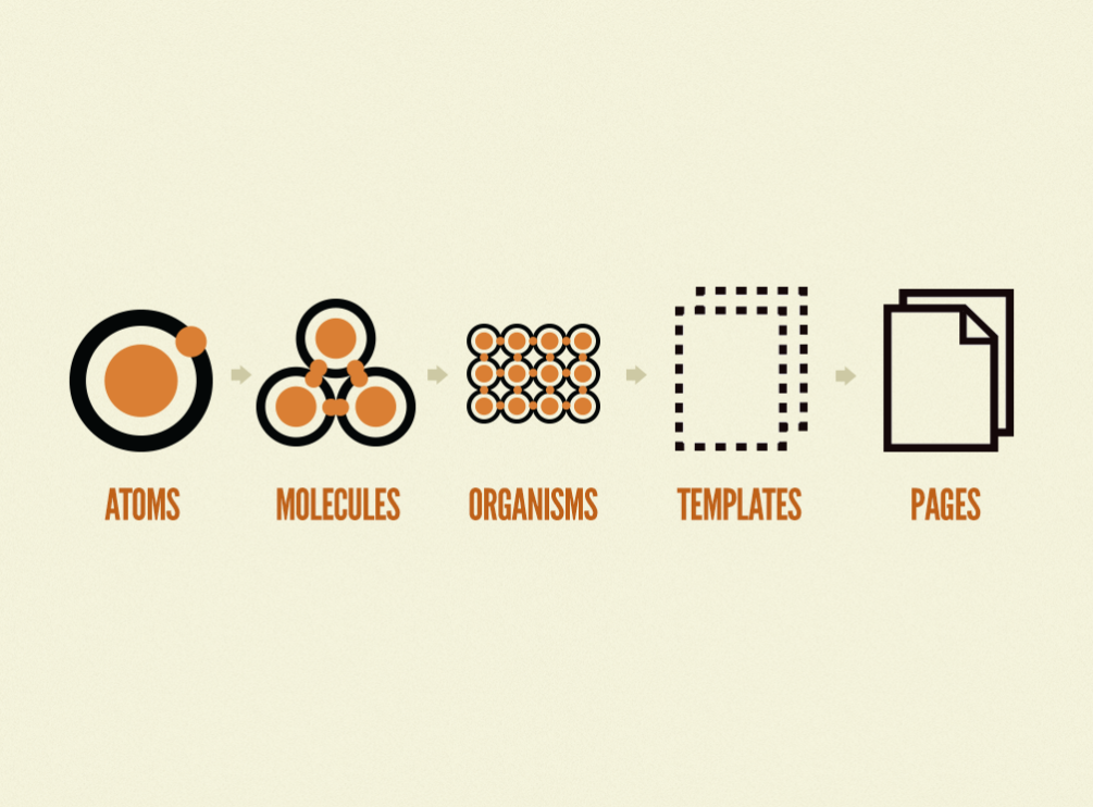
Atomic Design is a design method for breaking down design guidelines.
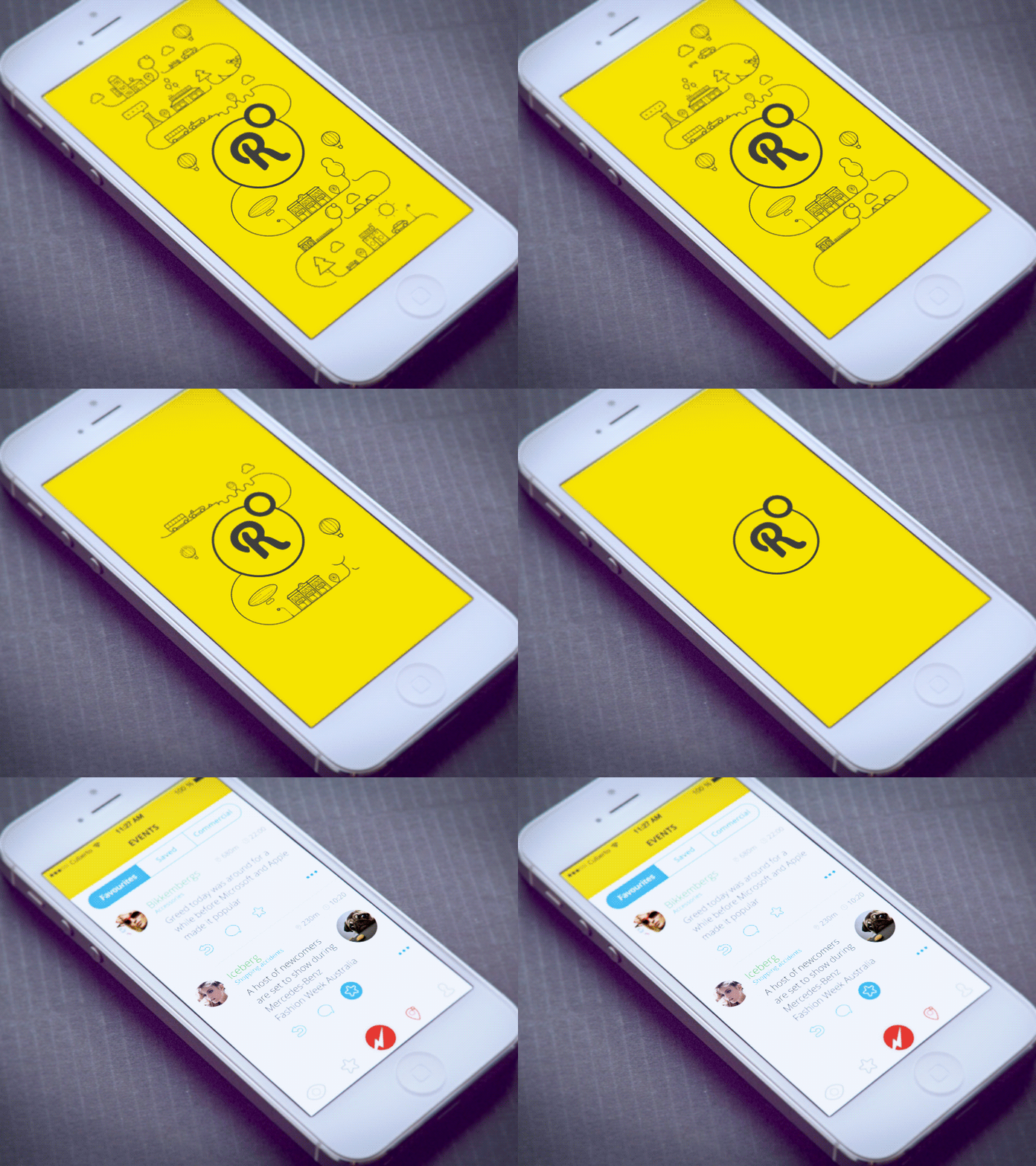
Does your brand move?
Animation is a great way of giving your brand a personality. User interfaces move, and they show and tell. How does your brand move? Is it joyful and bouncy? Is it serious and has stiff movements? You have to know these answers and integrate them in your guidelines.
Does your brand have a font-family with support for web font?
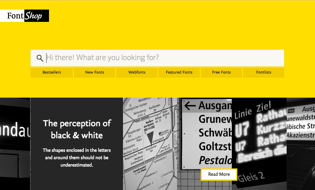
Web fonts have been around for some time and replace standard fonts such as Arial and Verdana for a digital context. At Font Shop, there are plenty of beautiful fonts that support digital design.
Are branding and UX design teams working together?
There’s a great deal that we can build upon and challenge together. Branding and UX design often want to achieve the same goal: a greater brand experience. The more we can blur the line between the two, the better overall. If a product or service is indistinguishable from its brand, then they have both succeeded.