A quick and dirty guide to writing clean microcopy
A quick and dirty guide to writing clean microcopy
You already know how important good copy is to your products and services. But not everyone has access to a writer whenever they need one. Content designer Jane Ruffino has some tips for improving copy in your prototypes and wireframes, even if you’re not a pro.
Content is about choosing the right words for the right audience at the right time. This is true whether you’re writing a 200-page technical guide, a 20-paragraph blog post, or a 3-screen onboarding flow. Like other aspects of design, it takes editing, discussion, teamwork, and testing, and it’ll take a few iterations to get right.
Even if you don’t have a writer on your product or project team, you can learn some tips and tricks to get microcopy to good-enough.
Your number-one priority is what comes next
In storytelling, before every sentence or section, we should ask ourselves, “What does the audience need to know next?” Do the same when writing copy in a product flow. What does the user need to know next? Give them the information they need to take the next step, and only that information.
If there’s more information they’ll want to know later, you can put it elsewhere in the product (and make it easy to find), just don’t distract them with it in a flow. It’s still a story, and the user wants to get to the next page.
Your next 10 priorities are below
You already know you need to write like a human, and make your words as useful and usable as possible. So here are a few ways to help you make that human-sounding copy tight and effective, even if you’ll hand it over to a writer later.
Use active verbs
An active verb construction is something like, “I found the file.” A passive one is, “The file was found by me.” There are cases where passive constructions are useful. These are usually where the subject of the sentence is unknown or unclear, or where you don’t want the user to feel blamed for something like an error (because passive constructions put the subject at a remove from the action). But most of the time, stay active.
Keeps nouns and verbs close together
Keep the action and the performer of the action together. It’s a good way to reduce mental strain while users scan for the information they want. It’s OK to have sentences that are longer than 3 or 4 words, as long as the related words are close neighbours.
Login v log in and signin v sign in
‘Log in’ is the verb. ‘Login’ is the noun. You use your login to log in. Ditto for sign in. And you ‘log in to’, not ‘log into’. And of course, no one has ‘logged on to’ the Internet since about 2003.
Use sentence case as your default
Title case is appropriate for titles. It Looks Like This. For most text, you’ll probably want to use sentence case because it doesn’t read like an 18th-century broadside announcing The King’s New Riding Britches. Sentence case looks like this, and it’s much easier to read. The important thing is to see the capitalisation you use as part of your design system, and be consistent about it.
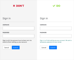
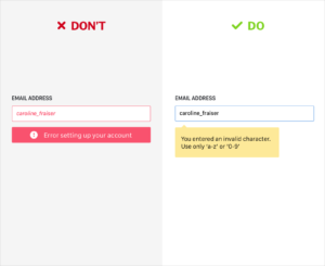
Don’t leave users hanging
Your error messages don’t have to be chirpy (sometimes that’s not appropriate), but they should be clear. Have they messed something up? Was there a system error? Tell them how to fix it, or at least explain what happened.
Avoid long Latin-based words
It’s common to be told, “Never use long words,” but this isn’t strictly true. The deeper issue is that long ‘business’ words in English are often Latin-based.
These kinds of words tend to have soft consonants and fizzle out toward the end, so they lack punch. They also sometimes have multiple, vague meanings (which is why they’re so common in corporate bluffing) and need a lot of context to make them clear. Plus, everyone hates these words. Try to find non-Latin words, especially clear nouns and verbs with specific meanings. They’ll usually be shorter, too, but that’s not always the case.
Use words and phrases your user will recognise, even if you don’t like them
All content is wayfinding in some way, but microcopy is signposting that helps a user to find their way around a space you’ve built. They don’t know the space as well as you do, so use signage they already know.
Reinventing the ‘Got it’ button is like trying to iterate on the stop sign. It might be clever but it also might cause an accident. And, related:
Think about who’s talking, and when
In a typical consumer service, headlines are often in second-person, where the company/developer/app/product is speaking, and buttons are the user’s response, which allows users to use their ‘voice’ through calls to action. Other times, there are no pronouns, just actions. There’s more to know about perspective, but think of it as a conversation and stay ‘in character,‘ and you’ll be fine.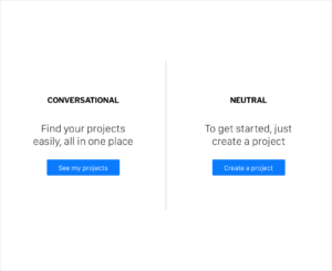
Let the user say ‘no’
Don’t use ‘maybe later’ unless they might genuinely want to postpone an action. Give them a chance to say ‘no.‘ Don’t just listen to me, listen to Dan Hon.
Don’t use Snowclones
Don’t use cliché, even if it seems funny in the moment. Not only is it boring, users also tend to mentally skip over cliché statements, so they might even miss what you’re trying to say.
Finally (yes, there’s more), don’t murder words in cold blood
It’s not that users ‘hate to read’, they just hate to read unnecessary words at the wrong time. Edit down to as few words as possible, and don’t fall so in love with your words that you can’t remove them, but don’t cross the line into verbicide.
Just like no one ever abandoned a service because a designer made a button blue instead of green, no one ever fell asleep because something was two words longer than it needed to be. If, no matter how tightly you edit, there are still too many words, maybe you have a design problem, not a copy problem.
Related reading
We love to write about what we do, what we learn along the way and what we play with.