Daresay's Icon Set for Inclusive Design

Daresay’s Icon Set for Inclusive Design
Designing an icon set for accessibility and inclusive design is an important task to make technology more accessible to everyone. In this article, we will explore the process of designing an icon set for accessibility and inclusive design.
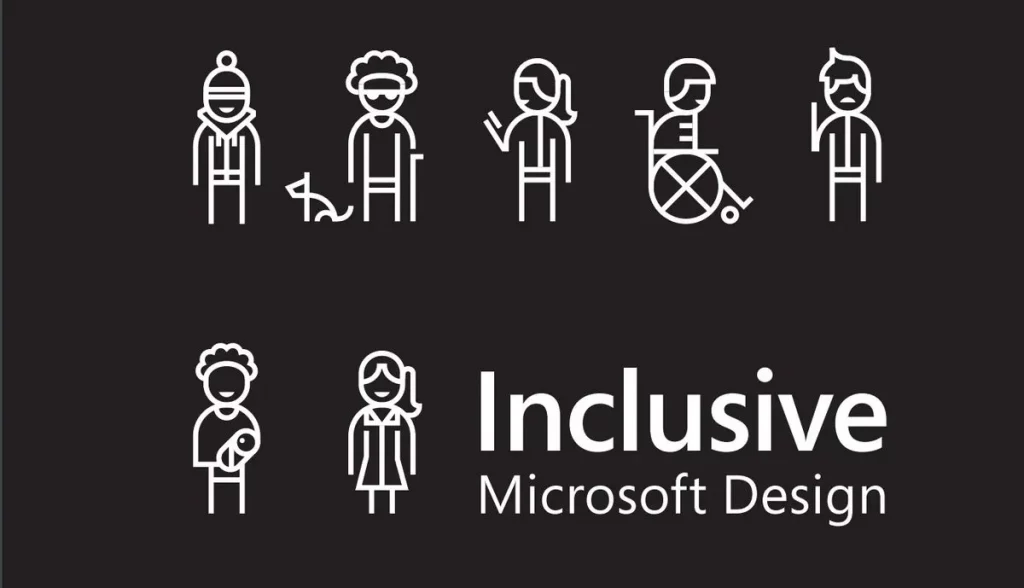
At Daresay, we are a design-focused tech company that places a high priority on accessibility. We strive to ensure that accessibility is a core consideration in all of our business deliverables, and we offer accessibility specialists to our clients to help them achieve their accessibility goals.
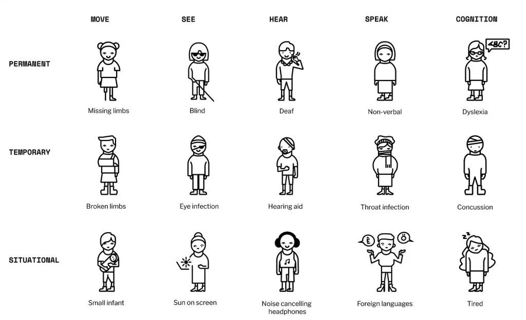
The ways in which we communicate on accessibility and inclusive design is so important. My mission was to create the Daresay accessibility icon set that includes our defined disability spectrum and contexts, as well as types of disabilities related to cognition.
The first step in designing an icon set is to identify who will use it and how. In our case, we wanted to create icons mainly for salespeople, developers, and designers to add to their presentations when talking about accessibility to customers.
Our team carefully evaluated various icon styles, including illustrative icons, pictograms, and UI icons, considering their context and intended use.
Ultimately, we chose a combination of illustrative icons and pictograms that serve as a branding and marketing tool, conveying a clear message to our target audience. Additionally, we wanted a visually appealing icon set that uses basic shapes to represent ideas.
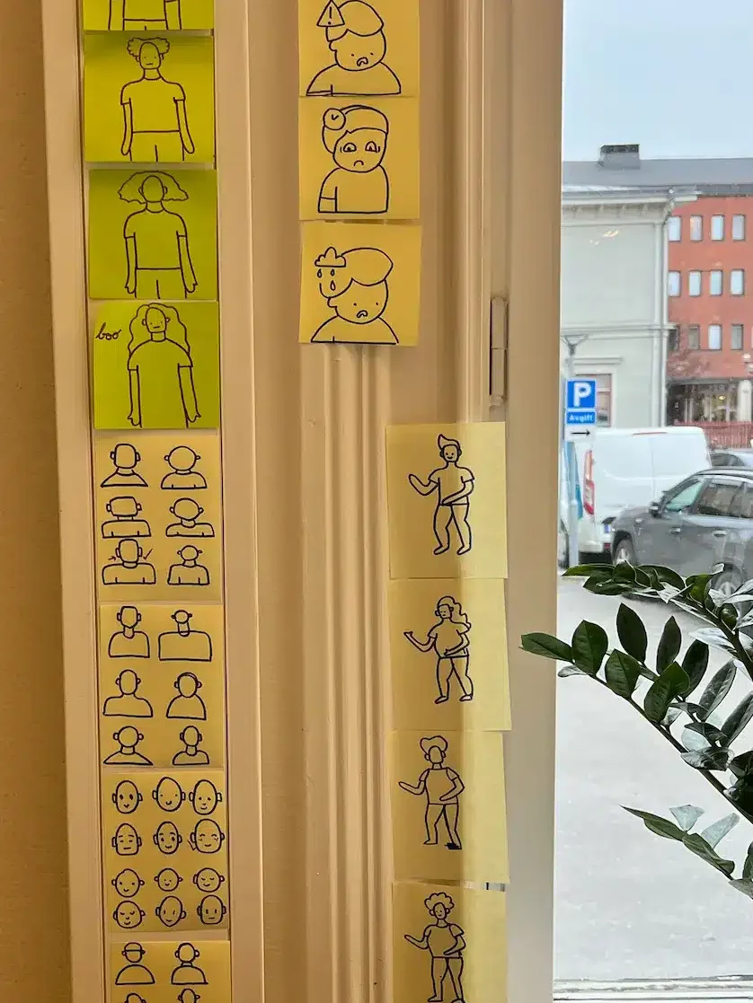
I started brainstorming ideas on paper, this was a fun and creative process that allowed me to come up with a wide range of ideas.

Including cognitive disabilities in the icon set presented a unique challenge in terms of design. Representing cognitive disabilities can be a complex task, as it may be challenging to create illustrations that are comprehensive and sensitive. For example, portraying individuals with Dyslexia in a manner that is both informative and respectful requires careful consideration.
The final icon set includes icons representing people with different disabilities in different states. For example, if you take the “Move” column, the permanent disability is someone with a missing leg and arm, the temporary disability is someone with a broken arm, and the situational disability is a new parent holding a baby. All these different people can have similar needs and pain points when typing a message on a mobile phone, for example.

Designing an icon set for accessibility and inclusive design requires careful consideration and collaboration. It’s important to keep in mind the needs of the target audience and to work closely with others to ensure that the icons are effective and meaningful.